
Streamlining complex pricing structures
Reducing churn by 15% with simplified pricing

Role
Team
Overview (TL;DR)
Problem
solution
impact
Background & project goals
ChargeNow connects EV drivers to public charging stations, but the pricing experience was a pain point.
The company was in the middle of the break-even phase. This project was super crucial because it allows the company to negotiate with energy providers (our stakeholders) to provide better costs to users and in turn make revenue through B2C conversions.
Each charging network operator used different pricing models and labels, resulting in:
Confusing costing categories
Difficulty comparing chargers quickly
Frequent support requests about price
Negative app reviews mentioning unclear pricing
Goal: To create a differentiating feature that would meaningfully increase user engagement.
Our hypothesis:
By making pricing clearer and easier to compare upfront, we could reduce churn by 15% within six months of launch.
Business hypothesis:
Pricing clarity could improve retention and trust, reduce support volume, and differentiate ChargeNow in a competitive market.
The problem:
Drivers didn’t understand pricing quickly enough to make confident decisions. The result:
Users hesitated to commit to chargers
Higher perceived cost regardless of actual price
Frustration and drop-offs during decision flow
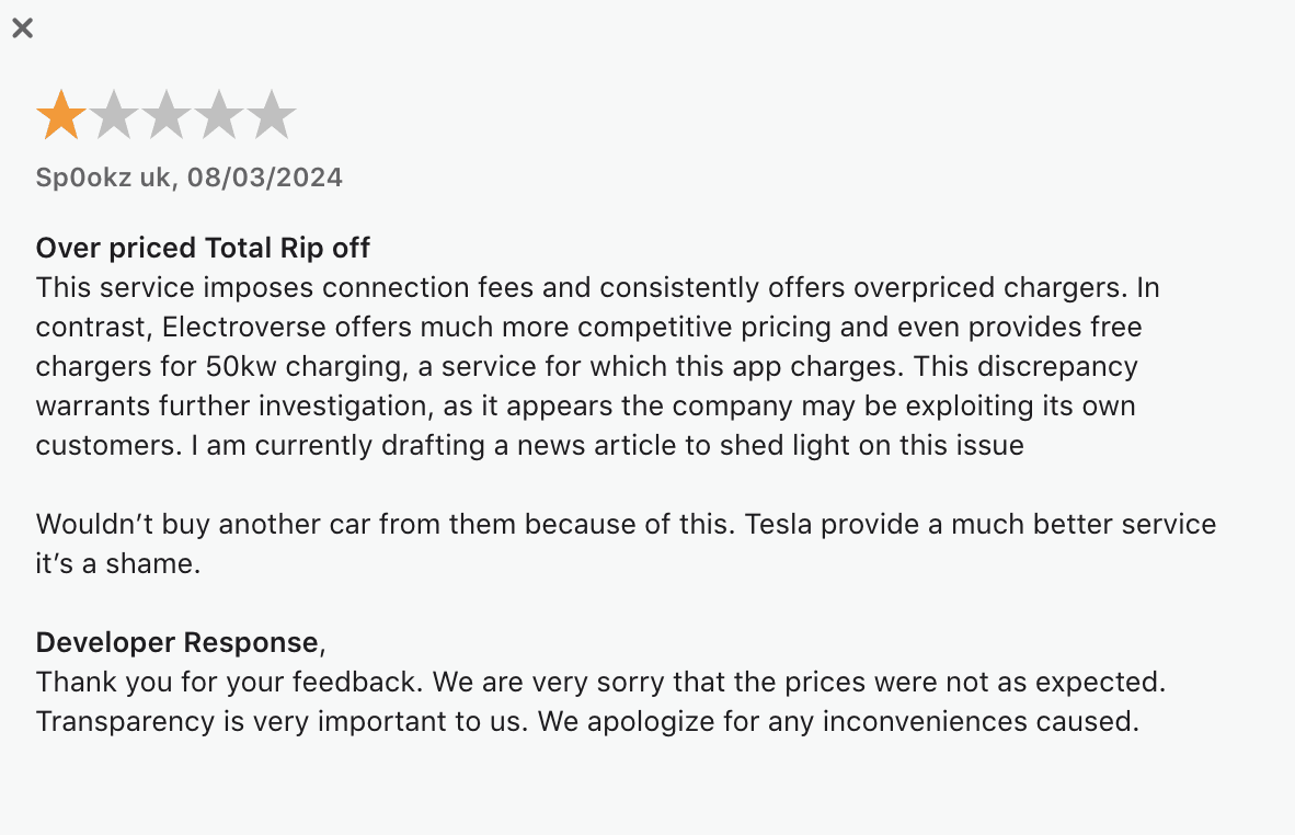
One of the customer reviews on App store
User research
According to customer insights, 35% of our users were expected to stop using the app due to pricing complaints.
We analyzed support tickets, app reviews, and conducted user interviews.
#1 Price visibility was hidden
Users had to click on each charger pin and scroll down the details to see price
#2 Confusing price breakdowns
Varying labels and structures made comparison difficult making users feel they are paying more than usual.
#3 Users couldn’t compare prices at a glance
Competitive chargers on the same screen didn’t show cost differences
#4 Frequent support requests about price
Customer support spends a lot of time resolving pricing issues which increases cost for the company
Why this problem was critical for business
Expected churn
~35% of user churn could be linked to pricing confusion
No trust
Non-transparent pricing reduced trust in the product
Competitive pressure
Competitors with clearer pricing were pulling users away
What success would look like
Before designing, we aligned on clear success metrics:
The feature has been pushed live only in Germany initially to observe user behaviour, post which it will be planned for rolling out in other EU countries.
% charging sessions initiated via the cheaper charger.
Churn rate for users exposed to new pricing UI (retention)
Reduction in pricing-related support tickets
Solution:
Clear, Scannable Pricing Everywhere
I designed a set of pricing enhancements that focused on visibility, clarity, and comparison.
Key features
Map-Level Price Tags
Solves: Hidden pricing details; delayed cost comparison
Users can see pricing cues directly on the map as colored currency icons, helping them identify cheaper chargers before tapping into details.
Design decision: Currency icons with color coding (green = lower cost, amber = medium, red = higher)

Simplified Price Breakdown Cards
Solves: Cognitive overload and inconsistent labeling
Each charger detail now shows a clean, modular price breakdown with clear labels and consistent structure.
Design decision: Simplify to 3 core elements: base cost, per-min/kWh cost, estimated total

Price Comparison Lenses
Solves: Long-trip planning and peak hour avoidance
Users can explore availability across the entire week, perfect for planning ahead or identifying consistently quieter times.
Design decision: 7 tabs for easy access, with the current day pre-selected by default.

competitor analysis
Before jumping into design, I did a benchmarking of competitors regarding pricing display
I benchmarked 5 direct competitors’ pricing UX:
Most had visible pricing on maps or list views
Few had cost breakdowns without tapping into details
Clarity correlated with positive user sentiment
The opportunity: make pricing visible without extra taps.
Competitors don't have distinguishers between cheap and expensive chargers on the map view.
Price breakdown was comprehensive to understand the different cost categories
One of the customer reviews on App store
Solution and features
Solution #1: Creating price tags on charging pins in the map view
By creating green price tags with "€" icon on pins indicate cheaper stations. The pins are visible when map is zoomed on street, station and regional levels.
Before
User cannot locate cheaper stations from a map view. They have to individually open each pin to scroll to pricing section.

After
Price tags give an overview of cheaper chargers and a pill in the pop-up shows for recall value.

Solution #2: I redesigned pricing categories that be used modularly for multiple categories
The design was created using modular components that can be reused to display different kinds of pricing models provided by the CPOs.
Improving the UX copy can provide more transparency to users. Here, the use of UI and colours makes scanning of info easy and comprehensible.
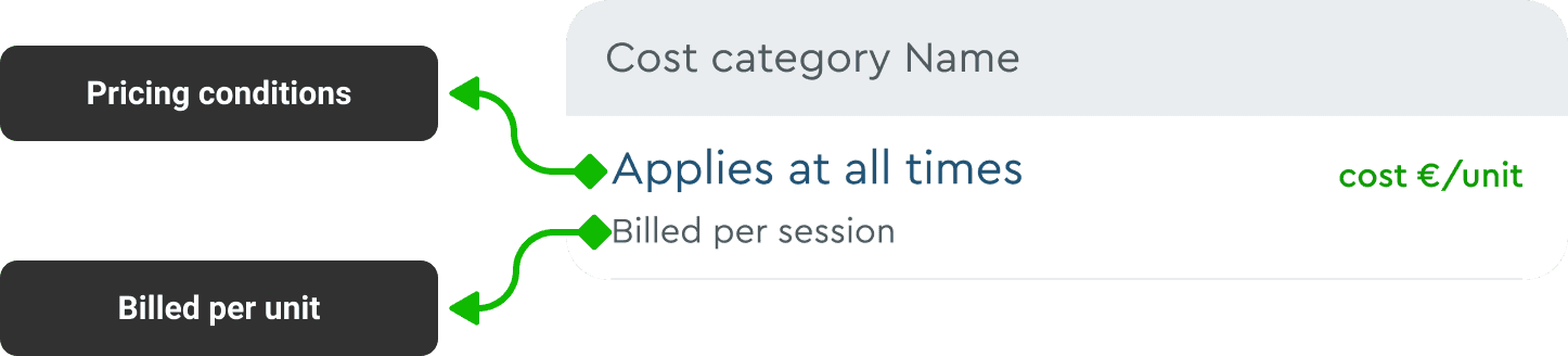
Semantic representation of a cost category card
Before
The price breakdown is incomprehensible.
The colours used for pricing are the same, making it difficult to scan and differentiate.
If prices were of "0" value, the back-end code hid it from users due to tech constraints.
Too much text creates a cognitive load for users.

After
Cost categories are renamed to distinguish.
UI colours for text are changed for easy scanning.
Free costs are shown upfront in green for transparency in prices.
Description text has been pushed to the bottom to reduce cognitive load.

Key learnings
Business goals directly impacts design
The company was in the break- even phase which prompted to make this project a priority to generate revenue by increasing transactions through the B2C app.
I learnt to apply critical and strategic thinking skills to create an MVP solution that would require very less development effort and costs to make a bigger impact that would align with business goals.
Devs helped with technical knowledge that made me design better
Modifying the pricing display was particularly challenging because the backend code was structured to calculate and present prices in a confusing way.
As a result, this project required me to thoroughly understand the backend code to effectively design and implement changes to the front-end interface.