
Role
Team
Background & project goals
Occibo is an AI-powered platform helping authors, parents and teachers create children's books. When I joined the project, the product vision covered writing, illustration, editing, publishing and marketing. However, with a small team and limited engineering resources, we needed to determine which problems to solve first for launch.
Goal: To create an MVP to determine product-market fit
Overview (TL;DR)
Problem
solution
I used user research, product discovery workshops, heuristic evaluation, and iterative design to prioritise the MVP, simplify the onboarding experience, and redesign critical workflows for both authors and parents without increasing engineering effort.
impact
Conducted 12 user interviews (9 authors, 3 parents)
Identified key opportunity areas across creation, illustration, publishing, and marketing
Helped define the initial MVP scope
Introduced role-based onboarding for different user types
Improved information hierarchy and AI guidance before launch
Delivered research-backed design recommendations within a two-week launch timeline
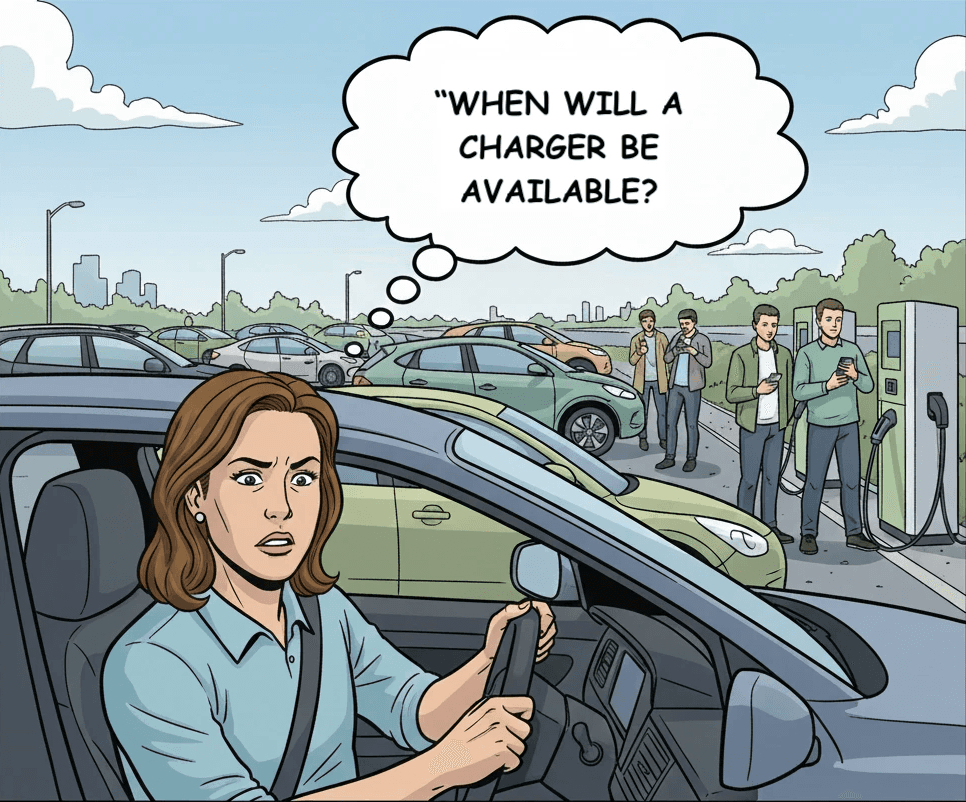
Image generated using Google Nanobanana
the challenge
The product already had an AI-generated MVP, but the experience lacked clarity, contained usability issues, and attempted to solve too many problems at once. With only two weeks before launch and limited engineering capacity, we needed to improve usability while narrowing the product to a testable MVP.
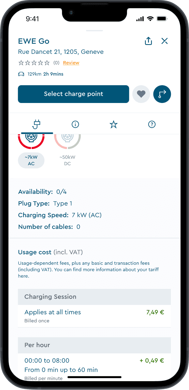
ChargeNow previously without UI forecasting
User research
Research
Research
Why this problem was critical for business
Expected churn
Approximately 35% of users were abandoning the app due to charging uncertainty
Impact on brand
Negative app store reviews cited "never knowing if chargers are available"
Competitive pressure
Users were exploring alternatives that might not have better networks, but felt more reliable
What success would look like
Track active users of the forecast feature vs. total app users
Measure charging sessions initiated after viewing forecasts
Analyze usage patterns by day/time to grasp user behaviour
Solution:
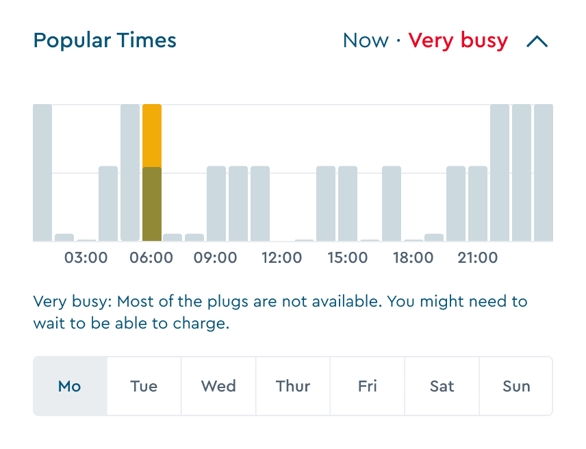
I designed Popular Times, an interactive forecast that combines:
Real-time charger status
Hour-by-hour availability predictions
Weekly patterns
Plug-specific accuracy
Key features
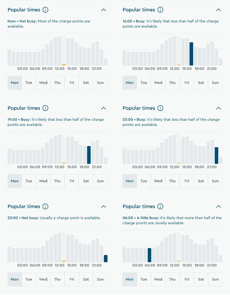
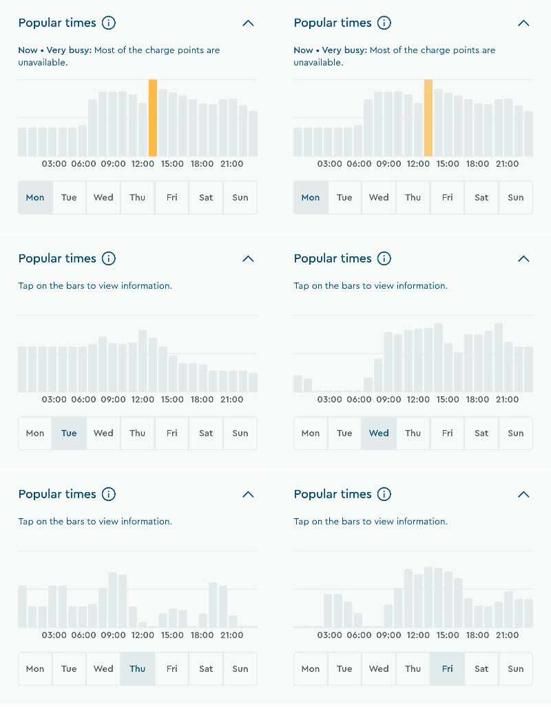
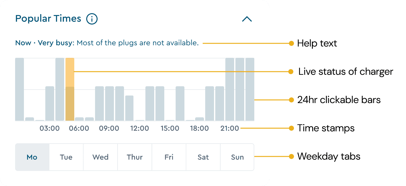
24-hour interactive forecast graph
Solves: Information gaps and plug incompatibility
Each of the 24 clickable bars represents hourly availability predictions based on the plug selected above. Users can tap any hour to see predicted occupancy, enabling them to plan charging around their schedule.
Design decision: Made bars interactive rather than static to encourage exploration and give users control over their planning.
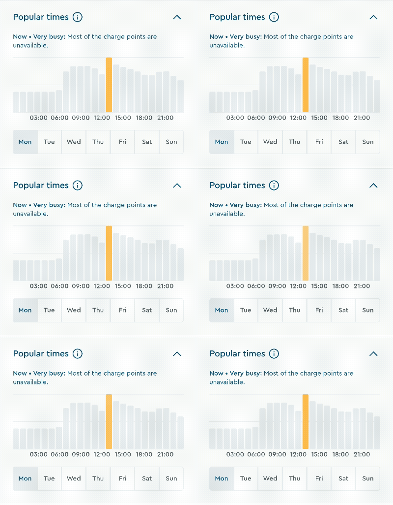
Real-time animated status bar
Solves: Trust and confidence in predictions
A live, animated indicator shows current charger status. This builds trust by demonstrating the data is real and current.
Design decision: Used animation to draw attention and signal "live" status without requiring explanation.
Weekly day selection tabs
Solves: Long-trip planning and peak hour avoidance
Users can explore availability across the entire week, perfect for planning ahead or identifying consistently quieter times.
Design decision: 7 tabs for easy access, with the current day pre-selected by default.
Collapsible section
Solves: Information overload and cognitive load
The section collapses to reduce scrolling while keeping critical details like pricing visible in the viewport.
Design decision: Allowed users to control their information density based on their decision-making needs.

Contextual help tool-tip
Solves: Data interpretation and transparency concerns
Info modal provides transparency about data collection and optional explanations for forecast data. Guidance appears only when needed, not cluttering the primary interface
Design decision: Made help optional and contextual rather than mandatory, respecting different user expertise levels.

How the forecast works (High-level)
Historical data: Last 2 weeks per charger
Live updates: Real-time API refreshes
Plug-specific: Accuracy tied to selected plug
Confidence cues: Visual indicators when data is limited
Design Process
I benchmarked 6 direct competitors to identify opportunities for differentiation:
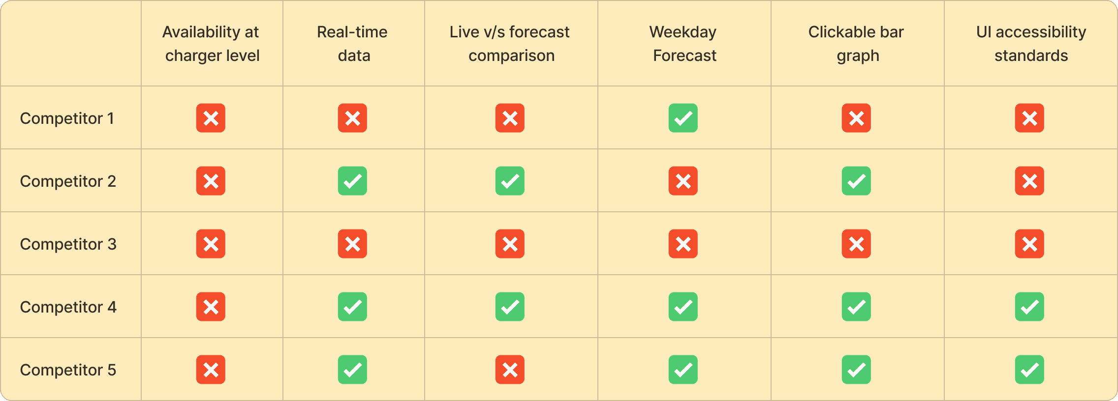
Key findings:
Most displayed aggregate station-level data (e.g., "3 of 8 chargers available")
This approach doesn't help drivers who need specific plug types at specific chargers
The opportunity: We can offer by providing charger-level predictive insights that matched real driver decisions.
Aligning on strategy and constraints
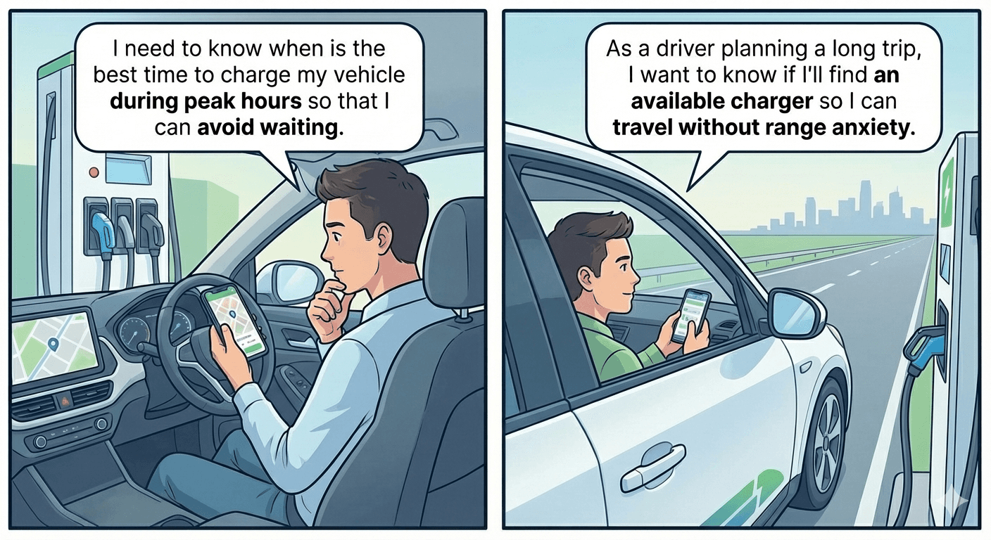
Image generated using Google Nanobanana
Before designing, I collaborated with the PM and developers to establish clear boundaries:
User stories that guided design-
I need to know when is the best time to charge my vehicle during peak hours so that I can avoid waiting.
As a driver planning a long trip, I want to know if I'll find an available charger so I can travel without range anxiety.
Technical possibilities that shaped solutions
The solution was designed based on these possibilities
Real-time API available for live charger status
Two weeks of historical data to generate forecasts
Forecast accuracy tied to specific plug types selected by user
Data may occasionally be unavailable at some stations
Three design principles guided every decision
Accessibility
Visualise data that is understandable for interpreting
Visual hierarchy
Focus on most important info which users want to see
Relatability
Reduce ambiguity and guide user to interpret correctly
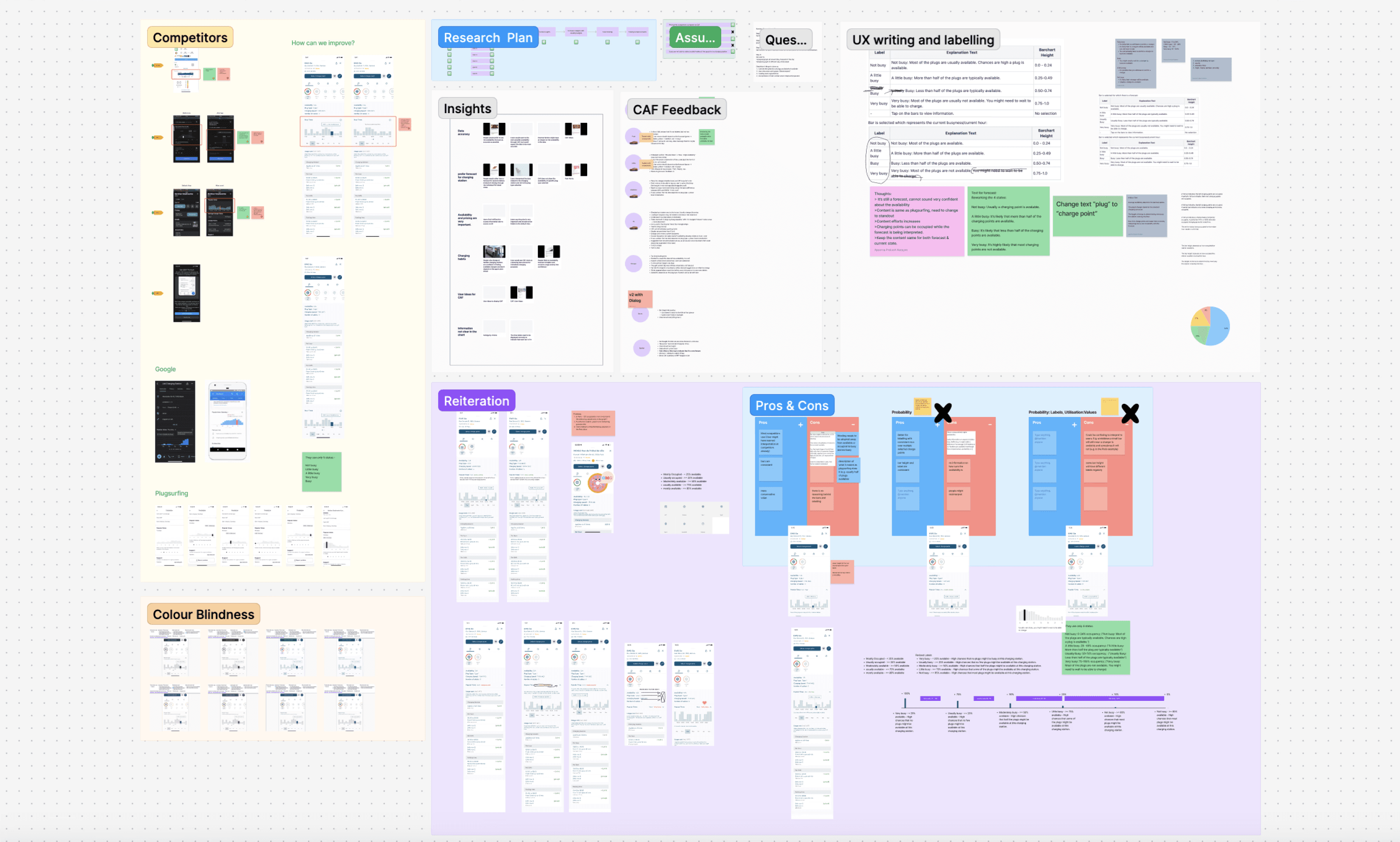
Qualitative and quantitative research. based on collaboration with PMs and Devs
user testing
To validate whether the forecast feature was intuitive and actionable, I conducted usability testing with 6 EV drivers.
Key tasks:
Interpret the availability bar graph
Check availability at a different time of day
Check availability on a different day
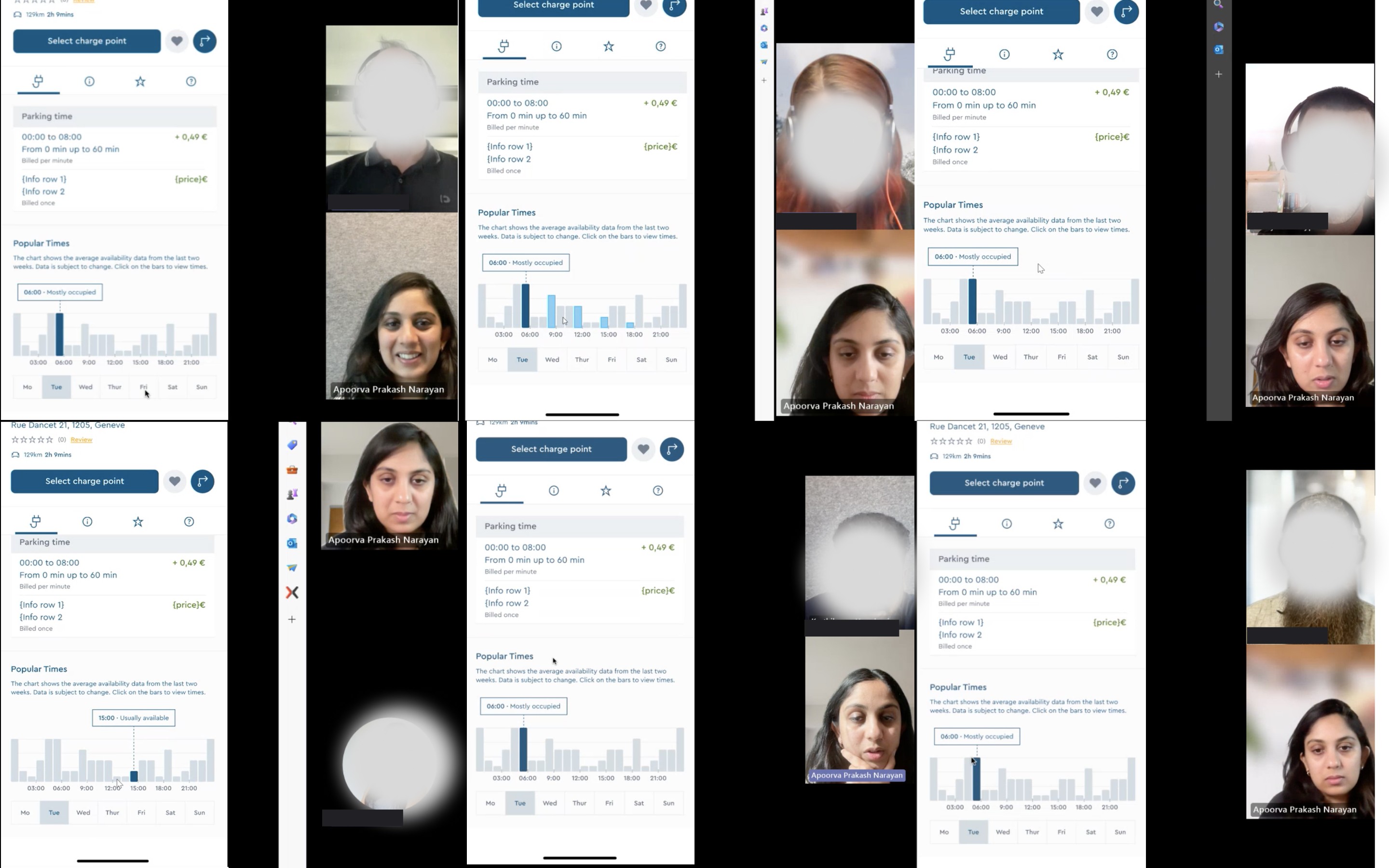
Moderated user testing with real users
Key insights:
Scanning took too long → Excessive scrolling slowed decision-making
Forecast required explanation to interpret correctly → Users needed help interpreting “busyness”
Current hour lacked visual emphasis → Users struggled to orient to “right now”
Plug dependency was missed → Forecast felt unreliable when plug changes weren’t visible
Trust depended on data transparency → Users wanted transparency around accuracy and edge cases
Decision #1:
Users in the interview mentioned that pricing is also important while choosing a charger.
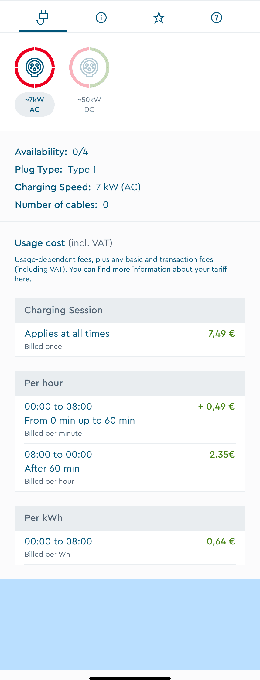
Version A (Rejected) : Below fold, hidden from view
Required extra scrolling to discover
Users couldn't connect forecast to their plug selection
Felt disconnected from decision-making flow
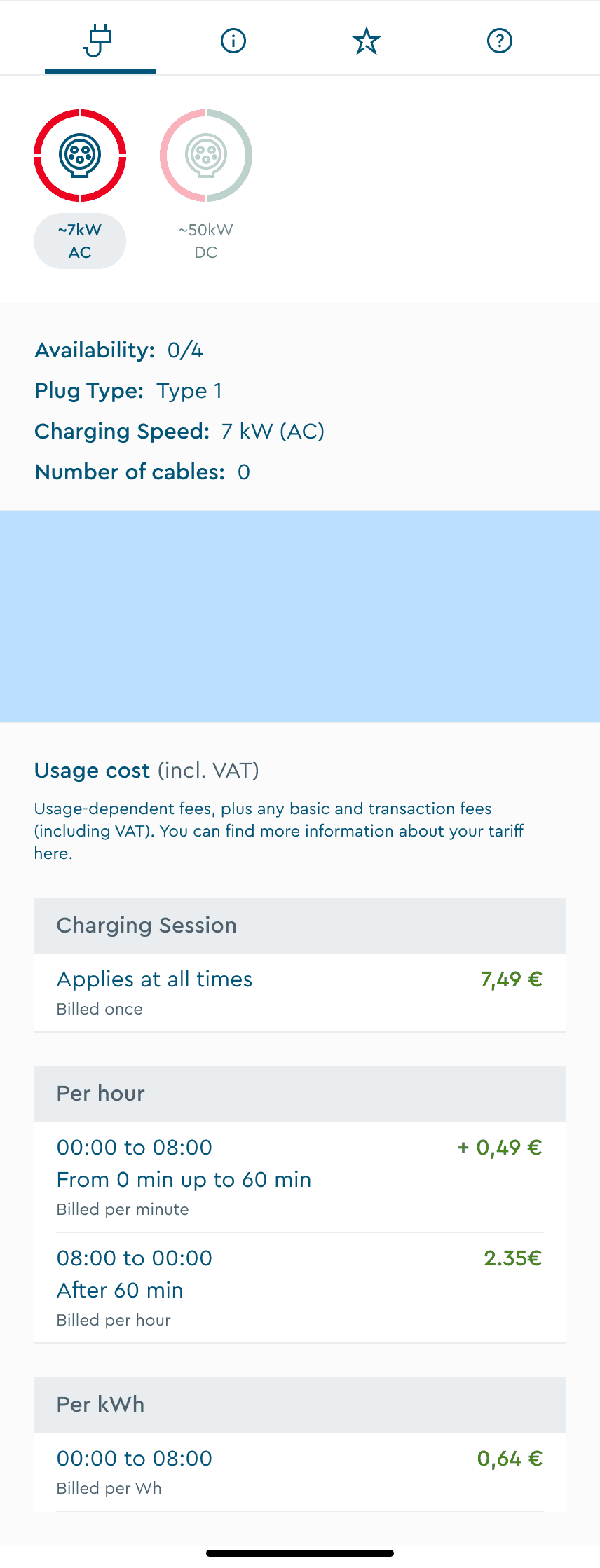
Version B (Selected) : Directly below plug selection
Section is closer to plug selection; hence it is relatable.
Pricing display is not hidden from view port.
Users preferred this logical information architecture
Decision #2:
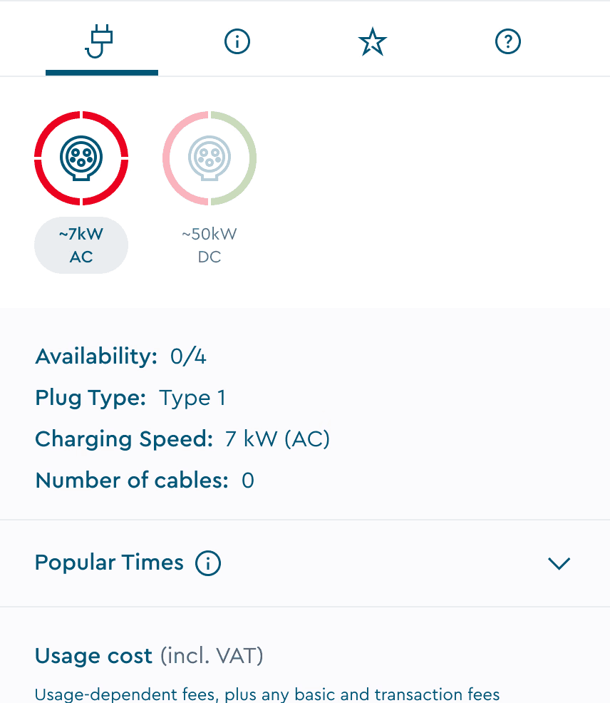
Forecast information changes based on the plug type selected, hence the feature should look relatable.
Provides more visibility for pricing display in the viewport.
Decision #3:
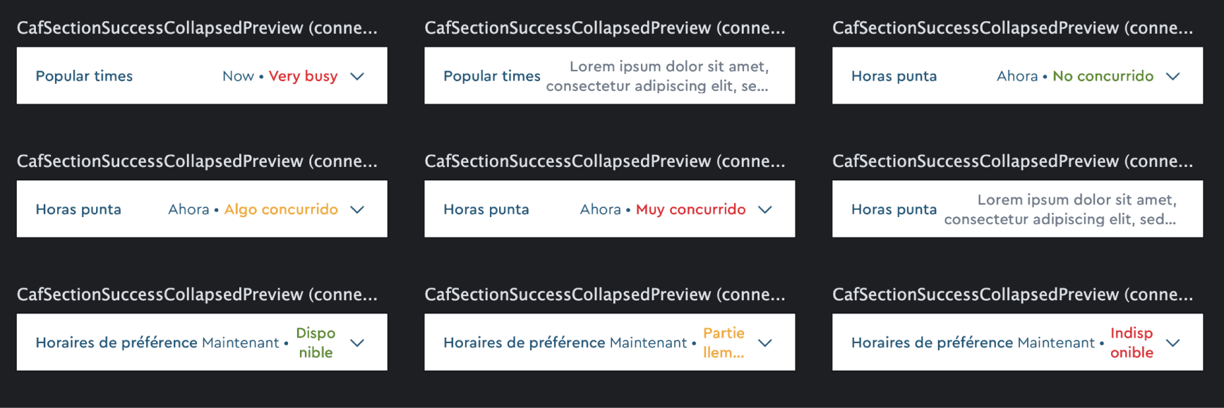
Initial design exploration used color-coded status labels ("Usually Available," "Usually Busy") for quick scanning in collapsed view. Iterations are under NDA and hence only mock-ups that did not make it to the project are shown here.
An idea that I thought of to show how the colour coded labels reflect the live status of the charger in collapsed view.



Expanded view with status label. This idea did not make it through as you can see why, below.
Early designs used text labels like “Usually Available.” When tested with translations (e.g. German), labels broke layouts. The character count increased and the design did not prove to be scalable because of spacing and readability issues.
Solution: This is the final design "Version 1" without preview labels but with an info icon went live. During the implementation phase, there were tech and priority constraints that stopped us from implementing advanced features (it will be implemented in the future.)
Decision #4:
Rather than designing one-off screens, I built components using atomic design methodology:
Atoms: Individual hour bars, status indicators, tabs, timestamps
Molecules: 24-hour graphs variants for different states, day selectors
Organisms: Full "Popular Times" section with all interactions
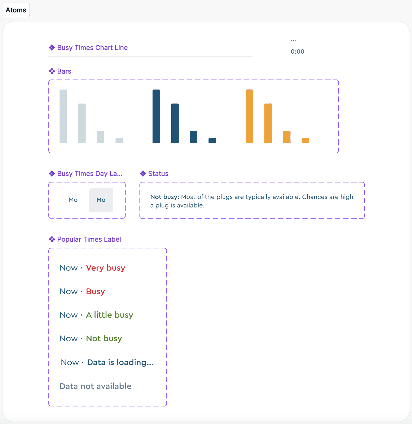
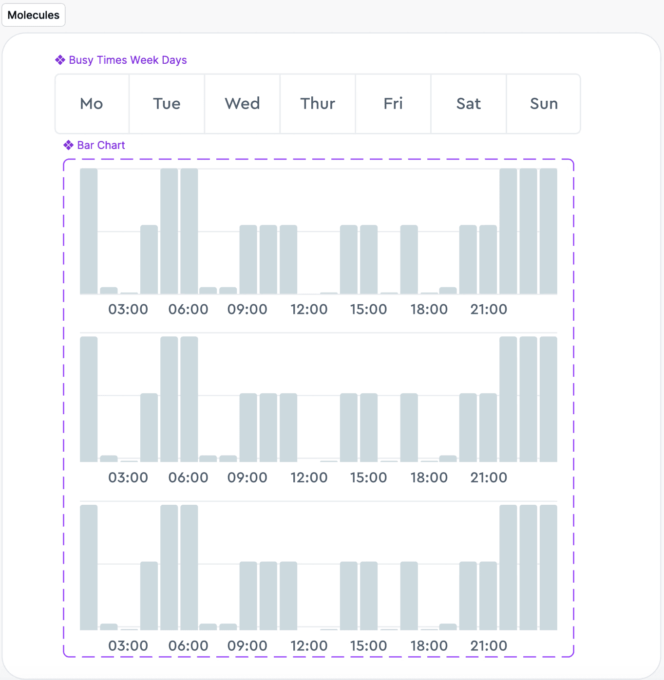
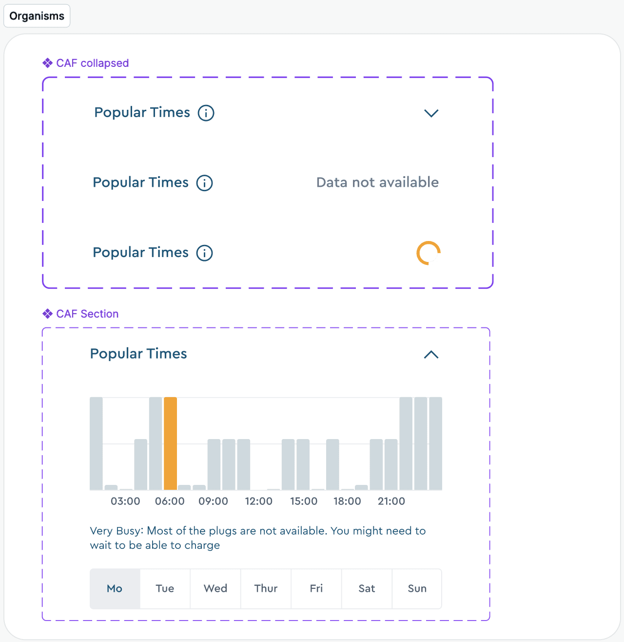
Design components of the feature built from scratch
Decision #5:
Working with developers during sprints was super helpful to identify edge cases.
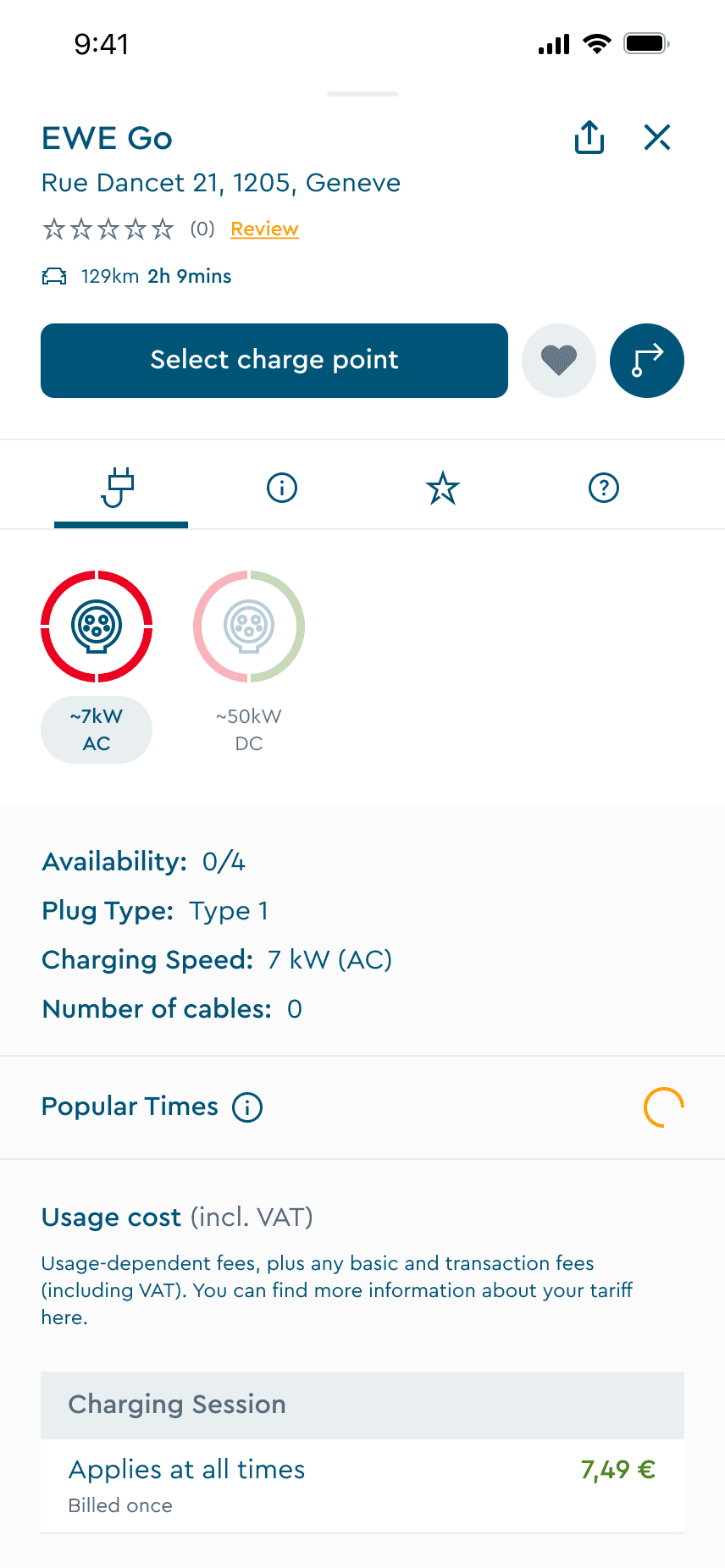
Loading state
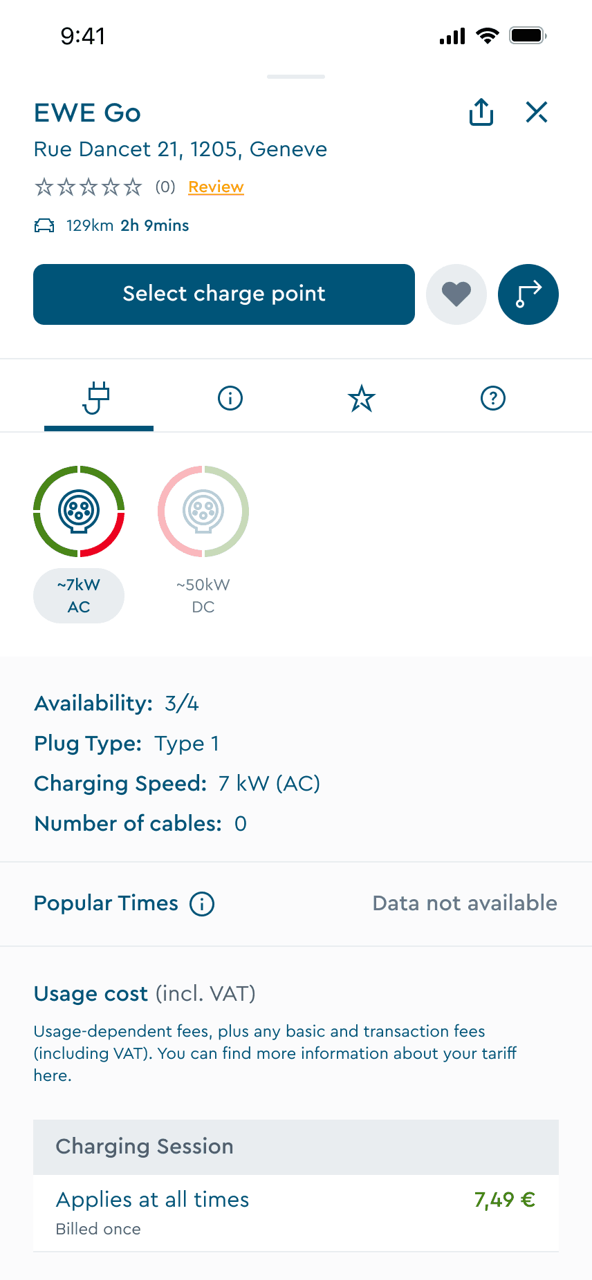
Data not available
Key learnings
The outcome
Popular Times launched successfully as ChargeNow's first predictive intelligence feature, directly addressing the uncertainty that was driving user drop-offs
The feature is currently live only for android users in Germany and is being monitored against our 25% user activity increase target. Early indicators show strong adoption and positive user feedback about finally having visibility into charging availability.
Business context shapes design strategy
The company's break-even phase meant limited developer capacity. This taught me to prioritise ruthlessly—shipping core functionality quickly to validate assumptions, then iterating based on real user behaviour rather than over-engineering upfront.
Takeaway: Impact isn't about launching everything at once. It's about shipping something valuable that solves the core problem while gathering data to inform Version 2.
Want to know more?
Due to NDA, I can’t share everything publicly, but I’m happy to walk through:
Research methodology & insights
Wireframes and usability testing
Version 2 iterations and future improvements
Impact metrics post-launch